


When Apple introduced Liquid Glass at WWDC 2025, it was supposed to be a game-changer. The company's Vice President of Human Interface Design Alan Dye called it "our broadest software design update ever," rolling out this translucent, dynamic design language across iOS 26, iPadOS 26, macOS Tahoe, watchOS 26, and tvOS 26. Here's the rub: what looked stunning in Apple's demos has turned into an accessibility mess. It highlights how narrowly Apple still designs for people.
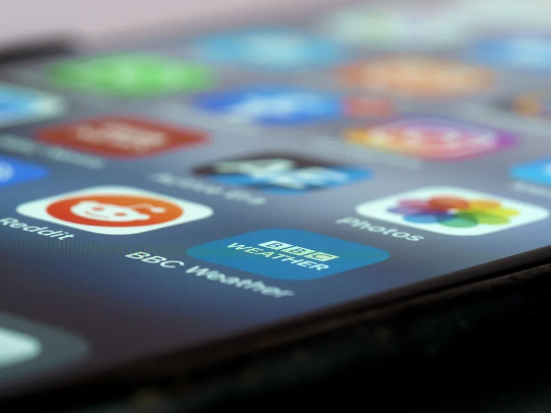
The reality is that Liquid Glass is giving iOS users vertigo. Apple's marketing talked up translucent layering and dynamic depth that would separate content and guide attention. Instead, people struggled with basic tasks. The initial beta was very hard to see the lock screen when notifications were present, which means the new design literally blocked the lock screen's main job, showing you what just happened.
This is not a minor UI hiccup. It is a symptom of a philosophy that prizes visual spectacle over human needs, and it forces an uncomfortable question. Who are these designs really for?
When beautiful design meets real-world problems
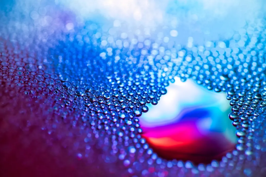
Let's get specific. The technical execution behind Liquid Glass is genuinely impressive, Apple's first major UI overhaul in 10 years, with lensing effects and contextual awareness that bend light and respond to content. The home and lock screens got completely redesigned. That skyscraping clock stretches over photo backgrounds with subtle transparency. There is even a new 3D effect that brings a hint of Vision Pro spatial magic to regular iPhones.
Now the downside. Those reactive lensing effects constantly shift the visual field, which can trigger motion sensitivity. Contextual awareness that feels clever in a demo turns noisy when you are reading a text while walking, or checking notifications as daylight swings from bright sun to dim train car.
Apple's implementation faces significant accessibility concerns around text readability and contrast ratios, especially where translucent elements sit over busy backgrounds. The Web Content Accessibility Guidelines require a minimum contrast ratio of 4.5:1 for normal text. Glass over varied wallpapers creates shifting contrast, so a screen that looks fine one moment can fail the next, with no warning to the user.
The result is not just visual discomfort. People report genuine neurological symptoms that interfere with actually using their phones. That points to testing gaps, not edge cases.
The beta testing reveals deeper issues
In response, Apple tweaked transparency across four betas — making navigation bars more opaque in Photos, Music, and the App Store. Later updates added an Accessibility toggle for reducing transparency.
The pattern is telling. The fact that early beta versions had issues that should have been caught long before public release suggests Apple tested for spectacle, not for messy, everyday use. We are talking about core functions, reading notifications and navigating the UI, not obscure settings.
The damage is sharper because Apple built a reputation on accessibility leadership. Critics argue Liquid Glass is not designed to be fixed and was never tested in real conditions. The controversy includes discussions that it favors aesthetics for their own sake, with no functional gain.
Ship first, patch later, that reactive stance undercuts the company's historically proactive standards. Somewhere along the way, Apple forgot the first rule, beautiful interfaces have to be usable first.
Samsung's answer: user control over aesthetics
While Apple banks on a one-size-fits-all sheen, Samsung went another way. Samsung launched Theme Park version 1.1.01.23 with an "Effects" menu offering five icon styles, Basic, Film Grain, Duotone, Glass, and Gradient. The Glass effect specifically targets the look Apple is chasing in iOS 26.
The key difference? Samsung lets you adjust opacity and transparency yourself, sidestepping accessibility issues by putting control in your hands. Their Effects menu provides granular controls for glass intensity so you can tune it for your eyes, your wallpaper, your light.
Picture it. Instead of one transparency level that looks perfect in a demo and awful on a subway platform at rush hour, you dial in what works for you. Someone sensitive to motion can soften the effect to a whisper. Someone who loves visual flair can turn it up.
That is not just nicer UX. It is an acknowledgment that technology should adapt to people, not the other way around.
The architecture advantage: modular vs. integrated
This is not only about sliders. It is about how the system is built. Samsung can implement UI changes through minor app updates because One UI is modular, while Apple's integrated system needs major OS passes for similar tweaks. That difference matters when you need to fix things fast.
Samsung's layered architecture means it can update glass effects via Theme Park without touching core files. Apple had to push multiple iOS betas just to improve readability. When users reported vertigo from Liquid Glass, Samsung could, in theory, ship a small refinement in days, while Apple faces months of beta cycles.
The feedback loop changes too. Samsung can fine-tune resource usage with targeted updates. Theme Park's latest update even brings stability improvements for One UI 7 devices, fine-tuning how glass effects talk to the renderer. Apple's monolithic approach makes that kind of surgical fix slower.
For users, that means Samsung can address accessibility and usability with precision. Apple tends to fix the whole system at once, and every change risks ripple effects.
Where Apple could learn from Android's flexibility
There is a bigger lesson here. Samsung's Theme Park approach shows inclusive design baked into the plumbing, not bolted on later. The Effects menu integrates with Samsung's broader Good Lock ecosystem, working with QuickStar for system bars and Keys Cafe for keyboards, so personalization becomes a toolkit, not a novelty.
The experience sticks too. Users establish their preferred opacity levels once, and the system keeps that choice across apps and updates. No crossing your fingers that the next beta happens to suit your eyes. No re-tuning the same setting after every system update.
Samsung's customizable glass UI treats human diversity as a given, not an exception. People have different visual processing abilities, different environments, different preferences. That shapes what "good design" looks like from one person to the next.
Meanwhile, Apple acts like there is one best answer that works everywhere, for everyone, all the time. The vertigo many users report suggests that assumption is not just wrong, it is harmful for people with different neurological and visual needs.
What this means for the future of mobile UI
The Liquid Glass blowback signals where mobile design is headed. Dark Mode adoption rates among Apple iOS users sit between 55 percent and 70 percent, a clear sign that people use visual customization when it is offered. The introduction of Dark Mode and customizable appearance options shows demand for interfaces that adapt to people, not to the preferences of a design team.
Samsung's implementation suggests the winners will balance visual invention with user agency. Apple is still iterating through betas, chasing one perfect setting for everyone. Samsung already ships a system that works differently for different people. The liquid glass effect has become popular among iPhone users precisely because it adds elegance, when users can control how that elegance shows up.
So the debate is not whether glass and translucency belong in modern UI. They do, and when used properly, glassmorphism can feel modern and futuristic. The real question is philosophical, Apple's "we know best" or Android's "you decide what works".
Right now, people report vertigo from Liquid Glass, while Samsung offers fine-grained controls that let you tune the effect to your needs. The market is nudging toward choice. Apple's vision looks gorgeous in a demo, but people live in the real world, different lighting, different sensitivities, different daily rhythms.
Until Apple accepts that human diversity demands technical flexibility, not uniformity, it will keep hitting the same wall, designing for an idealized user who does not exist, and pushing away the real ones who need interfaces that work with their bodies and minds.


Comments
Be the first, drop a comment!