


Apple's iOS 26.1 beta 4 landed on October 20th with changes beta testers have been hoping to see for months. Instead of endlessly tweaking Liquid Glass opacity based on complaints, which Apple has been doing throughout the beta cycle, the company handed the controls directly to users. A notable shift from Apple's typical "we know best" approach to interface design. About time.
This developer beta arrived about a week after the previous developer beta (iOS 26.1 beta 3) released on October 13, 2025 (2025-10-13), keeping Apple's rhythm and introducing its most user-focused customization yet. The strategy extends beyond iPhones too, iPadOS 26.1 and macOS 26.1 developer betas get the same treatment, so controls feel consistent across your Apple ecosystem.
Finally, some control over Liquid Glass
Here's the thing about Liquid Glass. Apple has been struggling with it since iOS 26's debut, but that struggle revealed something important about modern interface design. Throughout the beta process, the company made elements more opaque, then rolled back the changes, then changed direction again, each iteration trying to balance visual appeal with accessibility needs. It was like finding the perfect shower temperature. The real issue was that different users needed different temperatures entirely.
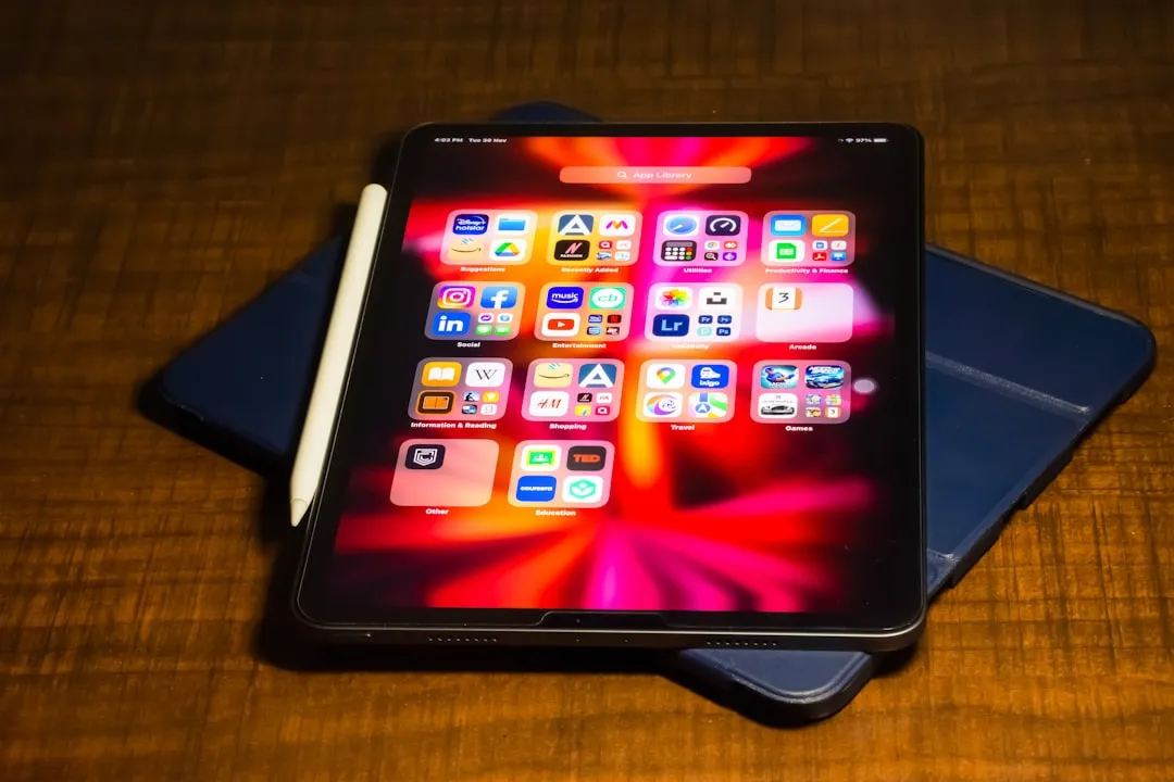
Rather than continuing this cycle, Apple is now empowering users to make the decision themselves. You can find the new controls by navigating to Settings > Display & Brightness > Liquid Glass, where you'll see two straightforward options: "Clear" and "Tinted."
The Clear setting preserves what you're familiar with from iOS 26. It maintains that original transparent design that shipped with the initial release. Your wallpaper bleeds through menus and interface elements, keeping the layered, glassy look.
Tinted mode addresses the accessibility and readability concerns that drove Apple's earlier struggles. According to Apple's own description in the beta, this option "increases opacity and adds more contrast," delivering a flatter, more solid appearance that prioritizes text legibility over visual flair. The difference is dramatic when you switch between modes, a clear choice between design elegance and practical readability.
What makes this implementation work is that the change applies universally across your entire system. It affects first-party apps, Lock Screen notifications, system menus, and third-party apps that have adopted the Liquid Glass framework, so the experience stays consistent.
Camera Swipe gets a kill switch
Another practical fix lands in iOS 26.1 beta 4. The update now includes a toggle to disable camera access via swipe, which cuts down on those moments when you pull your phone from your pocket and the camera is suddenly live.
This camera control builds on Apple's growing recognition that changes affecting long-held habits need escape hatches. During the iOS 26 beta cycle, the company introduced a "Classic Mode Switching" toggle that lets you revert to the pre-iOS 26 swipe direction when changing camera modes. You can find it in Settings > Camera under a new Mode Switching section.
The camera app underwent significant changes in iOS 26, with Apple repositioning buttons and controls throughout the interface. Mode switching now follows the direction of your finger swipes, whereas in iOS 18 and earlier, the selection moved in the opposite direction. Logical, sure, but it disrupts years of muscle memory for longtime iPhone users.
What this means for the iOS 26.1 release
These customization options signal a meaningful evolution in Apple's design philosophy. Rather than iterating on Liquid Glass opacity hoping to please everyone, the company has chosen to let users make personalized decisions based on individual needs, accessibility requirements, and aesthetic preferences.
The timing suggests these additions will be integral to the final iOS 26.1 release when it reaches general availability, according to current reporting. Mac users will find the Liquid Glass setting under System Settings > Appearance, keeping cross-platform consistency while respecting each system's conventions.
Apple kept the design simple, even with added control. This remains a binary choice rather than a granular slider for fine-tuning transparency levels. You pick the full glassy aesthetic or you prioritize contrast and readability, no middle ground. The Clear option will likely remain the default, preserving the original Liquid Glass experience for anyone who prefers Apple's intended design vision.
Where do we go from here?
These additions to iOS 26.1 beta 4 show Apple responding to feedback with practical empowerment instead of endless compromise. Rather than threading the needle with new opacity values that satisfy most people and still leave some frustrated, the company is providing tools that let users customize their experience based on personal visual needs and interaction preferences.
The Camera Swipe toggle addresses real-world device handling, while the Liquid Glass setting acknowledges that visual accessibility varies widely among users. Both features demonstrate Apple's growing willingness to add granular controls when broad design changes prove divisive. If this sticks, expect similar user-choice approaches whenever a big interface change sparks debate.
PRO TIP: If you're running the iOS 26.1 beta, try both Liquid Glass settings in different lighting. The Tinted mode shines outdoors or anytime visual clarity beats visual flair.
For those testing the iOS 26.1 beta, these features preview how Apple plans to balance design innovation with user autonomy in future updates. When iOS 26.1 officially launches, these toggles might quietly solve frustrations you assumed were baked in. Sometimes the cleanest answer to a design debate is simple, give people the tools and let them decide.


Comments
Be the first, drop a comment!