


Two months into using macOS Tahoe, I can honestly say this update has shifted how I work on my Mac. The initial buzz around Apple's biggest macOS overhaul in years settled into muscle memory. Some features stuck and turned into habits. Others faded without a fight.
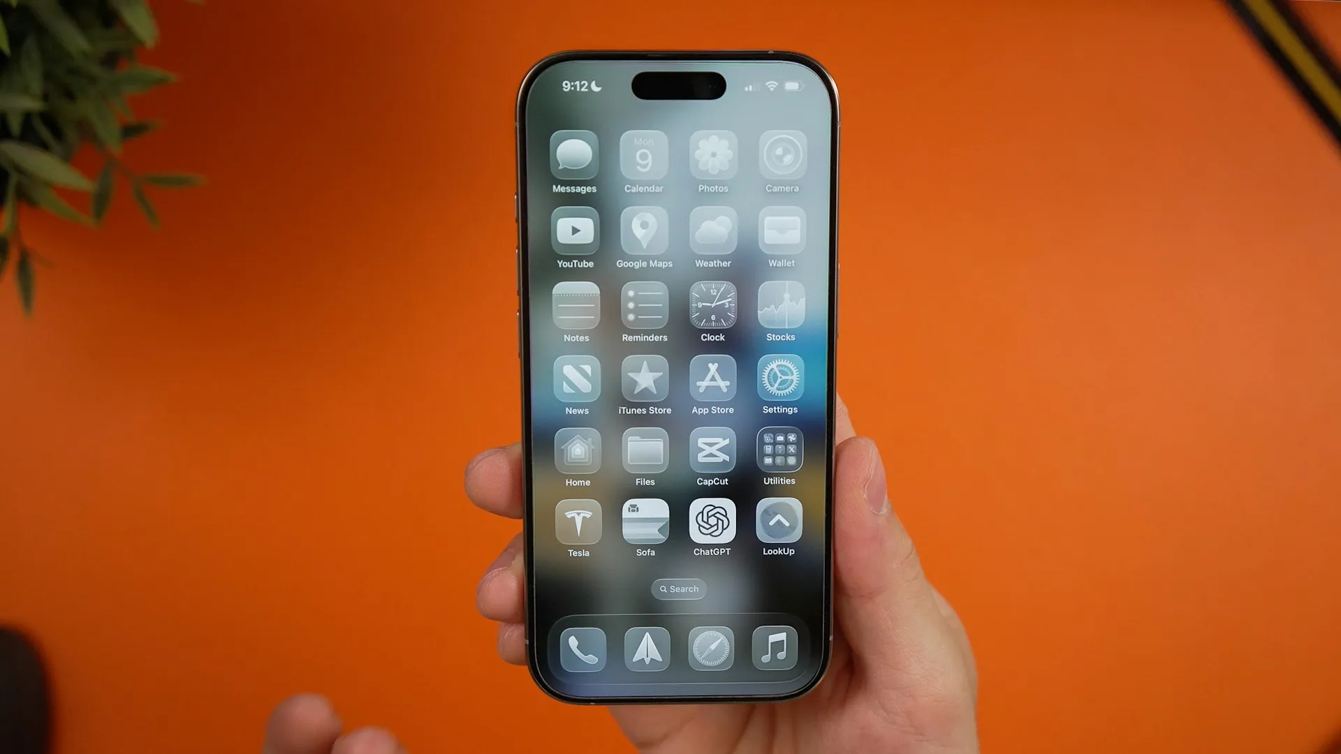
The visual change hits the moment you boot up Tahoe. Liquid Glass brings translucent, glass-like elements throughout the interface, a modern look that still feels familiar. The menu bar is now completely transparent by default, which makes the display feel a touch bigger while keeping everything where it should be.
Two months later, the refresh has grown on me. It looks premium without getting in the way. The transparency plays nicely with dynamic wallpapers, especially on bright mornings, and the readability worries I had on day one never showed up in actual use.
Spotlight's productivity revolution actually delivers
Here is the thing about Spotlight in Tahoe: it changes the rhythm of work. Spotlight's biggest update ever, allowing direct execution of hundreds of actions without jumping between apps, genuinely speeds things up. Not a marginal gain, a different way of driving the Mac.
The new structure matters day to day. Spotlight now includes four separate filters: Apps, Files, Actions, and Clipboard, which turns a simple launcher into a command center. The clipboard history feature, supposedly storing items for up to eight hours and making them accessible from the Clipboard view, has already saved a few oh no moments when I copied over something important.
The Actions category is the star. Typing something like "send email to Sarah about project timeline" and getting a pre-filled draft cuts out the fussy steps. It becomes second nature fast. I reach for Spotlight now for tasks that used to mean a little tour of open apps. Two months in, this single feature has cut my daily task-switching time by at least 30 percent. Why click around when a quick command gets you there faster?
Control Center customization hits the sweet spot
The revamped Control Center surprised me with how useful it is, not just how it looks. In macOS Tahoe, you can drag controls out of the Control Center and house them in your menu bar, ensuring they're always visible and accessible. It hits a clean balance, quick access without turning the menu bar into a junk drawer.
I use the multiple Control Center drop-downs with customizable icons and support for third-party apps far more than expected. Grouping controls into panels keeps me from hunting, system settings in one panel, media in another, only the essentials pinned up top. Tidy and fast. Which is the whole point.
Live Activities bridge the iPhone-Mac gap perfectly
This one looked gimmicky at WWDC, then proved essential once I lived with it. Live Activities from a user's nearby iPhone now appear in the menu bar on their Mac so they can stay on top of things happening in real time, like an upcoming Uber ride, flight, or live sports score.
Because of that, I almost never pick up my iPhone while working. Tracking a delivery, checking a score, watching travel updates roll in, it all sits in my peripheral vision. Fewer context switches, more focus. The first time I worked on a Mac without it again, I missed it instantly.
The features I thought I'd love but don't use much
A quick reality check. The new Phone app, while solid, has not wedged itself into my routine. The Phone app on macOS allows making and receiving calls, screening calls, and viewing voicemail summaries, yet habit wins; I still reach for my iPhone when a call comes in. Old dog, old trick.
Same story with folder customization with colors, symbols, and emojis. Fun for half an hour, then I went back to my usual structure within a week. Nice for quick visual cues, not a workflow changer.
The Journal app landing on Mac sounded great in theory. Journal comes to Mac, making it easy to capture and write about everyday moments and special events when inspiration strikes. In practice, I still lean on heavier writing tools for real work. Journal feels like a pleasant extra, not a pillar.
What's proven genuinely useful long-term
After the honeymoon period, three features became daily essentials:
Enhanced Spotlight functionality is the clear winner. Clipboard history, direct actions, and better search compress a lot of grunt work into one place, and my routine tasks finish faster with fewer app hops.
Control Center customization hits the right level of personalization. I surface what I actually use and hide the rest, and support for third-party apps gives it room to grow.
Live Activities integration finally aligns the iPhone and Mac in a way that keeps me informed without pulling me out of flow.
The visual refresh deserves a nod, too. macOS Tahoe 26 feels snappier and smoother, with animations tighter, app launches quicker, and background tasks feel lighter, which you especially notice when you jump back to an older machine.
Two months in, macOS Tahoe feels like a thoughtful update that boosts productivity without wrecking established habits. The best parts blend into your routine and make everything a bit easier. That is exactly how the best software updates should feel.


Comments
Be the first, drop a comment!