


Why the Apple Liquid Glass design award doesn't settle the debate
Apple's Liquid Glass design language has received an Art Directors Club award, institutional recognition that puts the most sweeping visual overhaul Apple has shipped since iOS 7 alongside work judged on craft and conceptual ambition. The Apple Liquid Glass design award confirms the redesign is being taken seriously in professional design circles. It does not resolve whether the design actually works on the devices people carry every day.
That gap is the story. Last September, half a dozen UX experts told Fast Company the redesign ranged from "mildly disappointing to outright broken," with criticism focused on an aesthetic-first approach that put legibility and accessibility at risk. The ADC jury and those UX professionals were not evaluating the same thing, and understanding that distinction is the only way to make sense of both verdicts at once.
What the ADC recognizes, and what it doesn't
Design awards at the institutional level ask whether an idea is coherent, ambitious, and executed with craft. They are not usability audits. The Art Directors Club, one of the oldest bodies in communication design, evaluates work on those terms, not on whether every screen is comfortable for every user.
Liquid Glass clears that bar on its own logic. The Verge called it "visually very impressive" and acknowledged the core effect is "very well done." The objections critics raise are about fitness for purpose, not quality of craft. An award jury seeing ambitious, well-executed systems design is going to respond differently than someone trying to read a notification on a busy wallpaper.
Apple is explicitly betting that Liquid Glass will redefine the visual language of its platform as it enters the AI era, Fast Company reported. That framing, a new foundational visual system rather than a cosmetic update, is exactly the kind of systems ambition design institutions tend to reward. The ADC recognized the vision. Users are living with the execution.
Why the Apple Liquid Glass redesign is still controversial
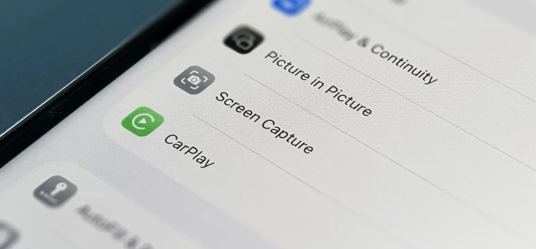
The central premise, as The Verge described it, is that UI elements should behave like three-dimensional physical objects: buttons and menus that refract digital light as they float over underlying content, as if made of real glass. As a concept, that is coherent. Applied identically across iPhone, iPad, Mac, and Apple Watch, it is where the friction begins.
Liquid Glass originated in visionOS, where windows appear to float transparently over physical surroundings as a functional requirement of the headset, not a stylistic choice, The Verge reported. The concept "makes sense for a VR headset." On Vision Pro, the spatial metaphor holds: the software is meant to feel three-dimensional because the user is navigating real and digital space simultaneously, The Verge noted.
On iPhone, it breaks down. Because every app runs full-screen, the interface is constantly in view rather than receding into the background. Liquid Glass doesn't integrate controls with content; it makes them continuously, visually active, shifting color and size in front of whatever the user is trying to read, The Verge noted. There is, as the same piece put it, no real world on the other side of an iPhone screen for the glass to reflect.
Apple Watch is where critics identified the sharpest failure. The Verge described watchOS 26 as "even worse," noting the device's core job is glanceability and that Liquid Glass makes everything harder to parse, blending watch faces into wallpapers and adding visual complexity to a context where speed is the only requirement.
What the Liquid Glass WWDC 2025 promise looked like against what shipped
Apple spent the beta cycle visibly correcting course. The first beta's Control Center was "a nightmare," The Verge reported, and Apple ran through at least three subsequent beta versions adjusting transparency and contrast levels before release. By the time the software shipped, menus that had been "so translucent they were unreadable" had become "a little more frosted and a lot more legible," The Verge reported.
Users who still find the effect disruptive can toggle "reduce transparency" in accessibility settings, The Verge noted, along with the pointed question that raises: if the design requires an accessibility workaround to be comfortable, what is it actually delivering?
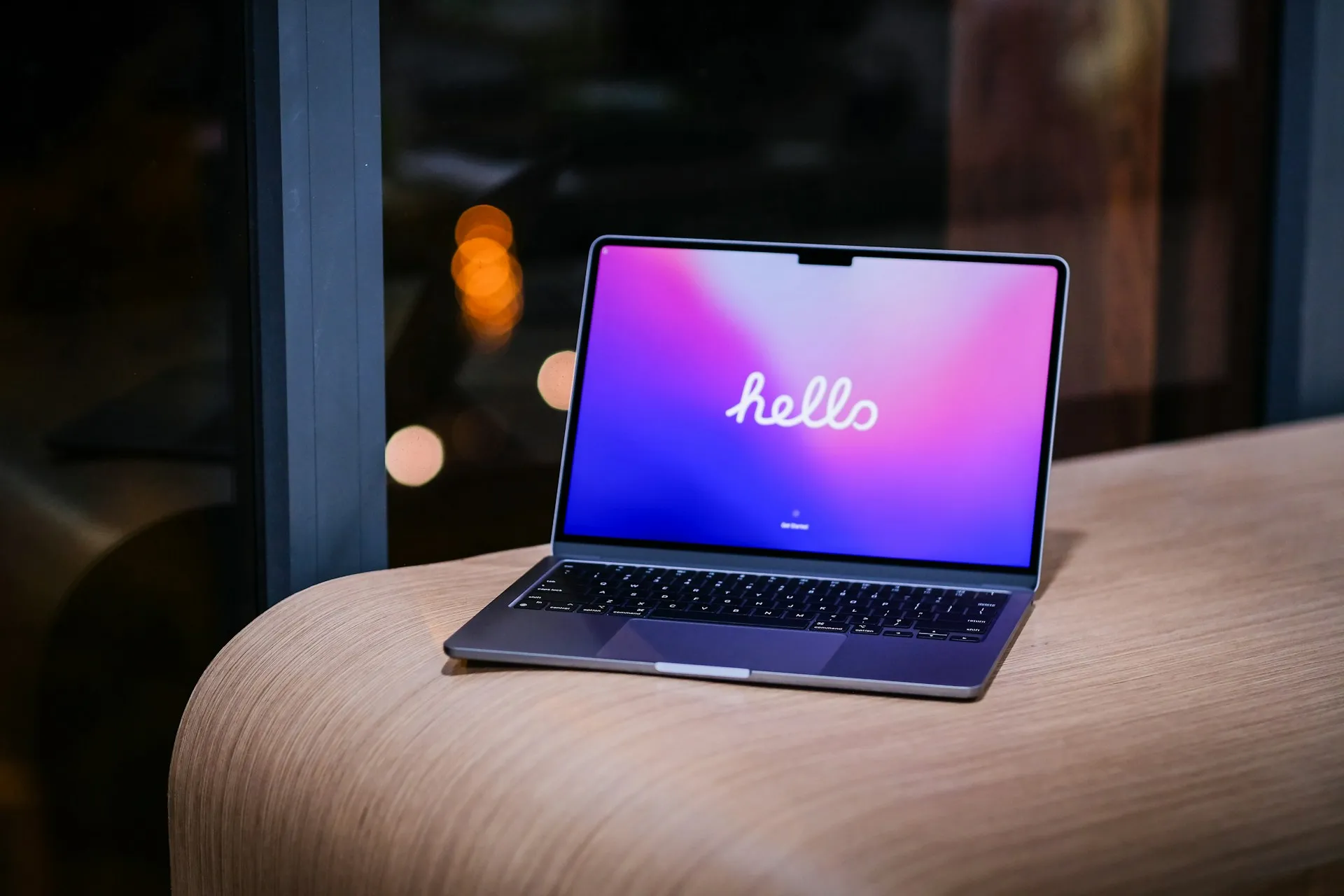
On Mac, the controversy largely doesn't land. The Verge reported that Liquid Glass "mostly gets out of the way" on macOS because there is less system-created interface for it to inhabit, with one reviewer noting they barely paid attention to it after a few weeks. That is less an endorsement than a demonstration that the metaphor causes fewer problems when it has less screen to occupy.
The broader picture, as Fast Company framed it, is that prior Apple releases suggest fixing Liquid Glass's core issues could take anywhere from months to years, and even then Apple could find itself wrestling with a flawed metaphor.
The real test: whether developers follow
Institutional recognition and user adaptation are both incomplete measures of whether a design language succeeds. Platform design succeeds when developers adopt it, and Liquid Glass has not yet passed that test.
As of a month ago, major apps including Netflix, Airbnb, Uber, and Reddit had not updated to reflect the new system, Tubik Studio reported. That hesitancy stands out against historical context: when Apple introduced a comparable platform-wide design shift in 2022, the developer community moved quickly, Tubik Studio noted. The current silence may not be permanent. It is still notable.
One data point captures the ambivalence precisely. GO Club, an App Store Award finalist, added a settings toggle letting users choose between the native Liquid Glass tab bar and a custom alternative, Tubik Studio reported. An award-nominated app quietly shipping an opt-out for Apple's own design system is a signal worth reading carefully.
The forward question, as Tubik Studio framed it, is whether Apple gives third-party developers enough flexibility to work within Liquid Glass rather than around it. If iOS 27 creates that room, holdout apps will likely update. If it doesn't, the silence gets louder.
What the award tells us, and what it doesn't
The ADC recognition is meaningful. It confirms that Liquid Glass is being evaluated as a serious design statement, not dismissed as a cosmetic refresh, and that its ambition reads as genuine to institutions built to judge exactly that.
What the award doesn't resolve: whether a spatial computing interface metaphor can be made to work across devices that don't operate in three-dimensional space, whether iterative beta fixes can close the legibility gap without undermining the core proposition, and whether major developers will decide the system is worth building for. Those answers will come from the App Store and from whatever Apple ships next, not from a jury.
Design awards and product success measure different things. Liquid Glass winning an ADC award makes complete sense, the same way a concept car can win at a design show before anyone finds out whether it can handle a commute. The more interesting question is which one this turns out to be.

Comments
Be the first, drop a comment!