


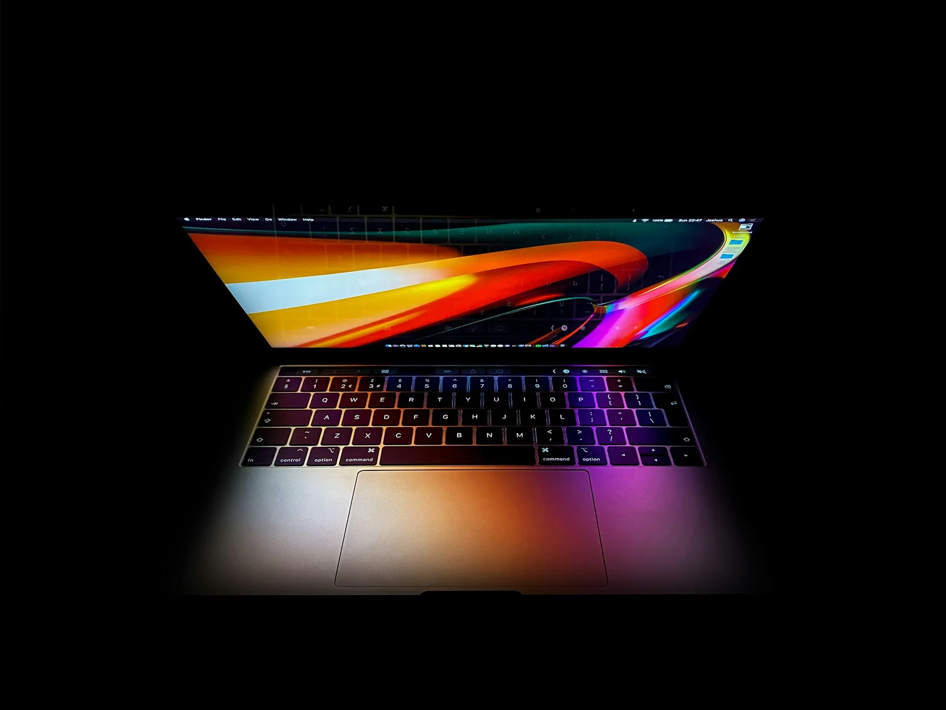
Apple's latest M5 MacBook Air, MacBook Pro, and MacBook Neo models introduce a keyboard change that longtime Mac users will spot the moment they sit down to type. The company has replaced text labels with universal symbols on five common keys: Tab, Caps Lock, Shift, Return, and Delete, according to Daring Fireball. Now, instead of seeing familiar words like "shift" or "return," you'll find the same glyphs that have appeared in Mac dropdown menus for decades.
This change brings U.S. keyboards in line with what the rest of the world has been using for years, as reported by MacRumors. If you've ever used a MacBook in Europe or pretty much anywhere outside America, these symbols will look completely familiar. It's actually the U.S. that's been the oddball here, clinging to text labels while everyone else moved to the universal glyph standard ages ago.
The partial transition tells a bigger story
Here's what's interesting about Apple's approach—they didn't go all-in on symbols. The company made strategic choices about which keys got the glyph treatment and which kept their text labels. You'll still see words alongside symbols on the Function, Control, Option, and Command keys, according to Daring Fireball. The Escape key also keeps its "esc" label rather than adopting some cryptic symbol.
This selective approach makes sense when you consider Apple's documentation challenges. The company's own support materials constantly reference these modifier keys by name—think "Option-Shift-Command-K" for keyboard shortcuts. Imagine trying to communicate that same shortcut using only symbols like "⌥⇧⌘K." It works fine in menus where space is tight, but it would create a communication nightmare in user guides, support articles, and pretty much any written instruction, as noted by Daring Fireball.
The timeline reveals Apple's measured evolution strategy. The company only added the Control (⌃) and Option (⌥) glyphs to U.S. keyboards between 2017 and 2018, after decades of text-only labels, according to Daring Fireball. This pattern suggests future changes will likely follow the same gradual approach, testing user acceptance before making more dramatic shifts.
Regional consistency finally comes to America
The biggest story here might be that American Mac users are finally getting the same keyboard experience as the rest of the planet. Apple has used these symbol-based key labels on European and international keyboards for years, according to MacRumors. This change essentially eliminates the U.S. as a holdout in Apple's global keyboard strategy.
What's particularly smart about this timing is how it aligns with Apple's broader ecosystem. The symbols now match what you see on iOS and iPadOS virtual keyboards, as reported by 9to5Mac. If you regularly switch between your iPhone, iPad, and Mac, that visual consistency should make the transition feel more natural rather than jarring.
The ripple effects extend beyond just the U.S. market. Countries like Canada, Australia, New Zealand, and Singapore typically receive the U.S. English keyboard layout as their default option, according to Mac Observer. So this standardization actually affects a substantial chunk of Apple's global MacBook sales while reducing the complexity of maintaining different keyboard designs for different regions—exactly the kind of operational improvement that benefits both users and Apple's supply chain.
Manufacturing and accessibility constraints
Let's talk about why Apple didn't go completely symbol-crazy with every single key. The manufacturing reality of MacBook keyboards involves sophisticated processes that directly influence these design decisions. Apple uses precise laser-etched legends and durable double-shot molding techniques to ensure key markings remain readable after years of heavy typing, according to industry analysis. This precision manufacturing approach supports Apple's commitment to long-term durability, but it also means changes must be carefully considered.
The accessibility factor plays a crucial role in Apple's decision-making. While symbols work fine for most users, clear text labels provide essential visual reference points for people with certain learning differences or vision challenges. By maintaining text on modifier keys while adopting universal symbols for action keys, Apple preserves accessibility without sacrificing visual standardization.
Apple's supply chain strategy also influences this measured approach. Creating entirely different key layouts for every market would multiply production complexity and costs significantly. The current solution achieves global consistency while maintaining manufacturing efficiency—a balance that reflects Apple's operational sophistication as much as its design philosophy.
What this means for Mac's future design direction
This keyboard evolution signals Apple's broader design philosophy of balancing visual minimalism with practical usability. The company clearly wants to reduce visual clutter and create cleaner aesthetics, but they're not willing to sacrifice functional clarity to get there. That measured approach demonstrates how Apple has learned from previous design controversies.
The timing is particularly strategic given the MacBook Neo's role as a potential gateway for PC switchers, according to 9to5Mac. Rather than creating barriers for new users, these universal symbols actually ease the transition since they're industry-standard conventions that PC users already know. The change reduces the learning curve instead of increasing it.
Looking ahead, this standardization across the new MacBook Air, MacBook Pro, and MacBook Neo suggests similar changes will likely roll out to Apple's standalone keyboards and other input devices, as reported by Mac Observer. Apple rarely makes design changes to just one product line—they tend to create unified experiences across their entire hardware ecosystem.
The key insight here is that Apple's approach demonstrates they understand the difference between change for change's sake and change that serves genuine functional purposes. By adopting universal symbols where they enhance global consistency while preserving text labels where they're necessary for communication and accessibility, Apple strikes a balance that should work for both longtime Mac users and newcomers to the platform. That's the kind of thoughtful design evolution that tends to age well rather than feeling like a gimmick a few years down the road.


Comments
Be the first, drop a comment!